
Round Two: Red Riding Hood
Margarita Surnaite vs Fernanda Suarez
Little Red Riding Hood is a classic fairy tale we hold in our hearts from a young age. Like a lot of fairy tales or folk stories, the subject matter isn’t all too uplifting, but the story can lead to a huge array of imagery that is easily recognisable to a universal audience. Both these images have an eerie quality to them and are primarily connected through the use of a red hood.

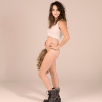
What I like about the first image (Surnaite):
I like that it is kind of cartoony and little surrealist through the oversized eyes and vibrant unrealistic colours. Our main lady looks young and a bit freaky! Confronting us straight on her huge red eyes and lips connect with her spotted red hoodie and made me think of Red Riding Hood right away. The fairytale aspect is further enhanced with the house and paper cut-out men in the background – to me this screams gingerbread men and Hansel and Gretel. The final thing that actually took me a while to notice are the two bodiless hands that reach forward into view. First, the white hand that comes around the girl’s arm, and second, the red hand that creeps out of the yellow curtains at the back. While this adds an element of theatricality (i.e. it could be from a stage show, not real life) I still see the scene in an organic way like it is natural and real. And I just love the perfectly executed level of creepiness this creates.

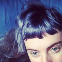
What I like about the second image (Suarez):
There is certainly a darkness in this image. The hood covers the woman’s face just enough and we can see her eyes peer out at us. They seem to glow and have an animalistic nature to them, which is further enhanced through the addition of the wolf. Again, we are confronted straight on by our Red Riding Hood, but this time she seems more in control (less catatonic than our first Red Riding Hood), and perhaps friends with the wolf? The moon-like light cast behind her places her outside with trees lit up – or is she also inside? Siting on stage with the curtain lit by a theatrical spot light? Technically, it is painted with skill and the subject matter is well thought out and sufficient.
Conclusions:
I’m going to award a strong winner to Surnaite’s image. It’s just the right amount of bizarre and creepy and is such a vibrant, eye-catching piece. The extra hands pretty much seal the deal for me. While Suarez’s image is good too, I’m preferring the creepy over the dark today.
Do you agree? Let me know who you would crown winner.
4 responses to “Round Two: Red Riding Hood”
Leave a comment
Top Posts & Pages


Follow on Bloglovin’

Support The Visual Female

This vs. That

Visual Female of the Month

Anna McKay Artist

Buy Art Prints

Actually, its a bit hard to do a comparison without knowing what medium the works are in. I wouldn’t directly compare, for instance, a digital work with an acrylic painting, or an oil painting with watercolors. Nevertheless, I try.
Surnaite has more depth, more play, more theatricals. It’s surreal and the oversized red eyes and bodyless hands add a strong element of spookyness! To me it represents more the theatrical performance of little red ridinghood rather than the story or the character of ridinghood itself.
Suarez on the other had is more about the characters. More precisely it seems to portray the paradoxical affinity that develops between a hunter and its pray, the attacker and it’s victim, the victim acquiring or “adopting” some of the characteristics of the attacker. This is, in fact, a real-life phenomenon.
The setting is enigmatic, almost hollywoodish but the simplicity of the composition really makes it stand out. I particularly like the artists choice of colors here to represent the spirit of the story. Black for the darkness, red for the blood, the circle to represent the moonlight (night) and the forest. The shadow covering the upper part of red ridinghood’s face is another masterful touch helping to enhance her “wolfish” image.
All in all, my vote goes to Suarez for depicting the spirit of the story, the hunter and the prey, as well as the two main characters and the fate that binds them in a masterful piece of visual imagery.
LikeLike
jav3d – although you make some apt and insightful points in your critique, I admit I was a little off-put by your very first sentence about the inability of comparing images created in different mediums. There will always be some element of ‘apples and oranges’, but I suspect the real challenge behind thevisualfemale’s ‘this vs that’ section is her self-employed challenge of drawing conclusions about which piece of art pulls on her he(art)-strings most, despite the fact they’re often constructed in different mediums.
I think of it as a challenging and innovative aspect of this section. Just my thoughts 🙂
LikeLike
I really love the surrealistic part of Sunaite’s picture, I find it is like a new, interesting way of seeing a tale that has been told over and over. I agree with your choice
LikeLike
Yeah I really love that piece and think you sum it up nicely!
LikeLike